
我在这方面工作了几个小时,但无法实现一个可行的解决方案。基本上,我想用CSS FlexBox在两列布局中组合一个全高的列(左)和下面的行(右)。
全高列应该与父级的div(.grid-main>main)的高度相匹配,而后者是一个grid-layout。
问题截图:
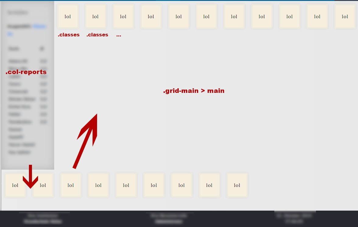
所以黄色的方框应该在整个高度的柱子旁边,而不是在它下面继续。列应该与.grid-main的高度匹配(这可以通过flex-direction:column来实现,但是下面的所有div也会在一个列中列出)。
HTML结构:
<div class="grid-main">
<header>...</header>
<nav>...</nav>
<main>
<div class="col-reports"></div>
<div class="classes"></div>
<div class="classes"></div>
<div class="classes"></div>
<div class="classes"></div>
...
</main>
<footer>...</footer>
</div>
CSS:
.grid-main {
  display: grid;
  height: 98vh;
  width: 98vw;
  overflow: hidden;
  position: relative;
  overflow: -moz-hidden-unscrollable;
  grid-template-columns: 175px 1fr 1fr;
  grid-template-rows: 0.1fr 1fr 0.05fr;
  grid-template-areas:
  "header header header"
  "nav main main"
  "footer footer footer";
  animation: fadeIn 1s;
  transition: 1s all ease-in-out;
}

.grid-main > main {
  display: flex;
  flex-direction: row;
  flex-wrap: wrap;
  align-items: flex-start;
  place-content: flex-start leftjustify-content: flex-start space-evenly;
  grid-area: main;
  position: relative;
  overflow-y: auto;

  background: var(--color-accent-main);
}

.col-reports {
  flex: 1;
  height: 100%;
  position: relative;
  max-width: 250px;
  padding: 20px;
  background: rgba(204,204,204,.7);
  box-shadow: 1px 1px 25px inset rgb(179, 179, 179);
  font-size: .8rem;
  font-weight: bold;
  line-height: 200%;
}

.classes {
  font-family: 'Lora';
  line-height: 2rem;
  background: #f6efe0;
  border-radius: 5px;
  padding: 20px;
  margin: 10px;
  border: 5px solid #eee9dd;
  box-shadow: 0 0 5px rgba(0, 0, 0, 0.07);
  animation: fadeInUp 1s;
}
将问题具象化:
我用下面的代码基本上解决了这个问题。所以来自@paulie_d的提示非常有帮助,尽管我希望避免使用网格进行这种基本的布局。
.grid-reports {
  display: grid; /* Grid in Grid */
  height: 100%; /* In contrast to Flexbox, Grid can be used to assign height: 100% to a container.
  It stretches to the parent container even if the viewport changes. Flexbox does not work with height actually.
  Unless you use flex-direction: column; to the parent container. */
  grid-template-rows: 1fr; /* optional */
  grid-template-columns: 1fr 6fr;
  grid-area: main; /* referes to Main in .grid-main */
}

  .col-students {
    grid-row: 1; /* .col-students must only be in the first row of .grid-reports  to stretch */
    grid-column: 1; /* Only the first column of .grid-reports */
    max-width: 250px;
    padding: 20px;
    background: rgba(204,204,204,.7);
    box-shadow: 1px 1px 25px inset rgb(179, 179, 179);
    font-size: .8rem;
    font-weight: bold;
    line-height: 200%;
  }

  .col-reports {
    grid-column: 2; /* All childs of .col-reports and itself are in the second column of .grid-reports
    Note: grid-rows are automatically assigned, because they are not adressed any further */
    display: flex; /* .col-reports becomes now a Flexbox to align its child items (box). */
    flex-wrap: wrap; /* All child elements automatically break */
    flex-direction: row; /* All child elements flow in a row */
    align-self: flex-start; /* To align items next to each other and at start of Flex */
    padding: 10px;
  }

  .col-reports .box { /* Further definitions of the element in .grid-main */
    flex-basis: 45%; /* So the flex-basis in this case relates to the .col-reports
    and not to the whole .grid-reports which makes sense and is desired behaviour.
    45% means that 45% of .col-reports are used, which is in the second column. */

    /*Note: This needs to be assigned as 100% in the mobile section, because elements
    must be placed under each other for mobile devices. */
  }
