GWT Highcharts 带倒轴样式曲线的折线图

GWT Highcharts 带倒轴样式曲线的折线图 介绍
我们已经在《GWT Highcharts 入门案例》一章中看到了用于绘制此图表的步骤。现在让我们考虑以下示例以进一步了解带倒轴样式曲线的折线图。
GWT Highcharts 带倒轴样式曲线的折线图 示例
package com.yiidian.helloWorld.client;


import com.google.gwt.core.client.EntryPoint;
import com.google.gwt.i18n.client.DateTimeFormat;
import com.google.gwt.user.client.ui.RootPanel;
import org.moxieapps.gwt.highcharts.client.*;
import org.moxieapps.gwt.highcharts.client.labels.*;
import org.moxieapps.gwt.highcharts.client.plotOptions.AreaPlotOptions;
import org.moxieapps.gwt.highcharts.client.plotOptions.LinePlotOptions;
import org.moxieapps.gwt.highcharts.client.plotOptions.Marker;

public class HelloWorld implements EntryPoint {
    public void onModuleLoad() {
        Chart chart = new Chart()
                .setType(Series.Type.SPLINE)
                .setInverted(true)
                .setChartTitleText("Atmosphere Temperature by Altitude")
                .setChartSubtitleText("According to the Standard Atmosphere Model")
                .setLegend(new Legend()
                        .setEnabled(false))
                .setToolTip(new ToolTip()
                        .setFormatter(new ToolTipFormatter() {
                            @Override
                            public String format(ToolTipData toolTipData) {
                                return toolTipData.getXAsLong() + " km: " + toolTipData.getYAsDouble() + "°C";
                            }
                        })
                )
                .setLegend(new Legend()
                        .setEnabled(false)
                )
                .setAreaPlotOptions(new AreaPlotOptions()
                        .setFillColor(new Color()
                                .setLinearGradient(0, 0, 0, 1)
                                .addColorStop(0, 69, 114, 167)
                                .addColorStop(1, 2, 0, 0, 0)
                        )
                        .setMarker(new Marker()
                                .setEnabled(false)
                                .setHoverState(new Marker()
                                        .setEnabled(true)
                                        .setRadius(5)
                                )
                        )
                        .setShadow(false)
                        .setHoverStateLineWidth(1)
                );

        chart.getXAxis()
                .setReversed(false)
                .setAxisTitleText("Altitude")
                .setMaxPadding(0.05)
                .setShowLastLabel(true)
                .setLabels(new XAxisLabels()
                        .setFormatter(new AxisLabelsFormatter() {
                            @Override
                            public String format(AxisLabelsData axisLabelsData) {
                                return axisLabelsData.getValueAsLong() + "km";
                            }
                        })
                );

        chart.getYAxis()
                .setAxisTitleText("Temperature")
                .setLineWidth(2)
                .setLabels(new YAxisLabels()
                        .setFormatter(new AxisLabelsFormatter() {
                            @Override
                            public String format(AxisLabelsData axisLabelsData) {
                                return axisLabelsData.getValueAsLong() + "°";
                            }
                        })
                );

        chart.addSeries(chart.createSeries()
                .setName("Temperature")
                .setPoints(new Number[][]{
                        {0, 15}, {10, -50}, {20, -56.5}, {30, -46.5}, {40, -22.1},
                        {50, -2.5}, {60, -27.7}, {70, -55.7}, {80, -76.5}
                })
        );
        RootPanel.get().add(chart);
    }
}
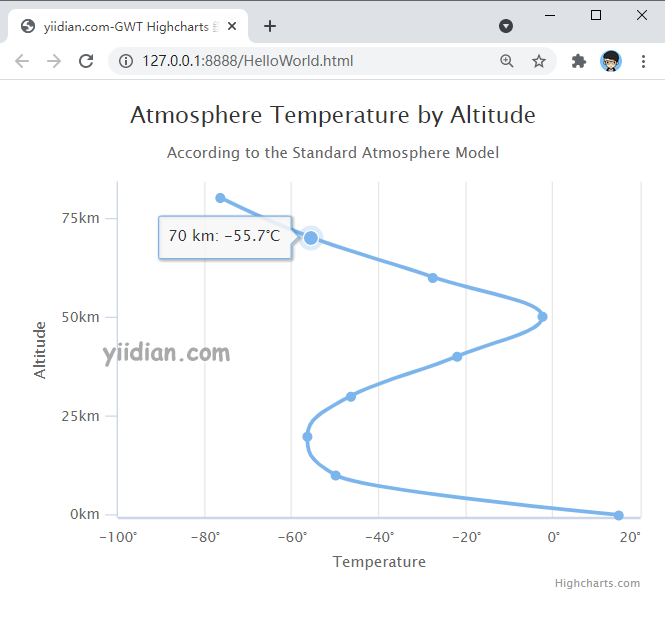
输出结果为:
热门文章
优秀文章