
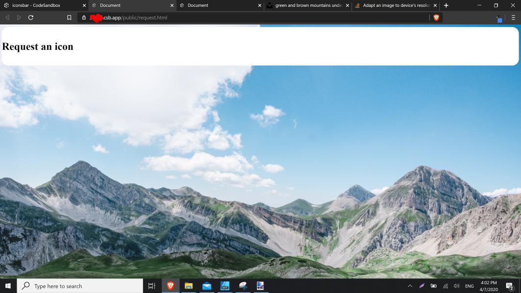
它在我的笔记本电脑上显示良好:
但不是在移动设备上:
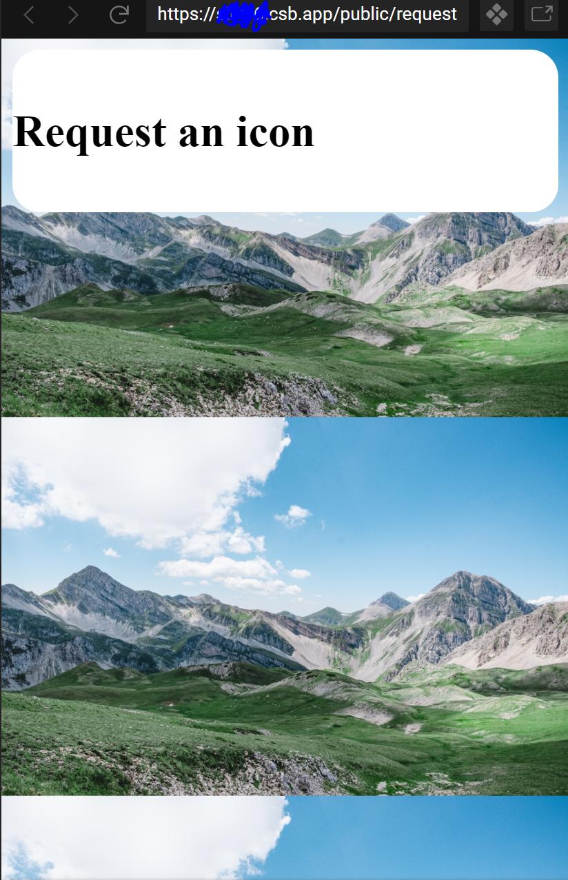
我的问题是,我怎样才能使它成为手机上的背景(即它只是图片的中心位置)
我的代码:
HTML:
<!DOCTYPE html>
<html lang="en">
<head>
  <meta charset="UTF-8">
  <meta name="viewport" content="width=device-width, initial-scale=1.0">
  <meta http-equiv="X-UA-Compatible" content="ie=edge">
  <title>Document</title>
  <link rel="stylesheet" href="../css/card.css">
</head>
<body>
  <div class="main">
    <br>
    <h1>Request an icon</h1>
    <br>
  </div>
</body>
</html>
CSS:
body {
  background-image: url("../images/public/card.png");
  background-size: cover;
}

.main {
  background-color: #fff;
  border-radius: 20px;
}
和图片:https://unsplash.com/photos/_WRWOWWTLRG
(我知道我可以添加background-repeat:no-repeat;)
这里是CSS媒体查询使您能够格式化您的文档,以正确地呈现在不同大小的输出设备上。
/* Smartphones (portrait and landscape) ---------- */
@media screen and (min-width: 320px) and (max-width: 480px){
 /* styles */
}
/* Smartphones (portrait) ---------- */
@media screen and (max-width: 320px){
 /* styles */
}
/* Smartphones (landscape) ---------- */
@media screen and (min-width: 321px){
 /* styles */
}
/* Tablets, iPads (portrait and landscape) ---------- */
@media screen and (min-width: 768px) and (max-width: 1024px){
 /* styles */
}
/* Tablets, iPads (portrait) ---------- */
@media screen and (min-width: 768px){
 /* styles */
}
/* Tablets, iPads (landscape) ---------- */
@media screen and (min-width: 1024px){
 /* styles */
}
/* Desktops and laptops ---------- */
@media screen and (min-width: 1224px){
 /* styles */
}
/* Large screens ---------- */
@media screen and (min-width: 1824px){
 /* styles */
}
因此,您可以根据移动设备的大小使用上述媒体查询,并确定该背景的宽度和高度
嘿,你有没有试过简单地这样做:
background-size: cover;
background-position: center;
background-repeat: no-repeat;
我不知道你的目标是什么,你说的“(我知道我可以添加背景-重复:不-重复;)”是什么意思 靠这个。 不管这对你有什么帮助。
background: url("https://images.unsplash.com/photo-1593539651148-13fb61a49325?ixlib=rb-1.2.1&ixid=eyJhcHBfaWQiOjEyMDd9&auto=format&fit=crop&w=1050&q=80") no-repeat center
    center/cover;
这是background速记属性
