我正在尝试子集一个图层,其中我通过管道将数据传递给ggplot。
这里有一个例子:
library(dplyr)
library(ggplot2)
library(scales)

set.seed(12345)
df_example = data_frame(Month = rep(seq.Date(as.Date("2015-01-01"),
                                             as.Date("2015-12-31"), by = "month"), 2),
                        Value = sample(seq.int(30, 150), size = 24, replace = TRUE),
                        Indicator = as.factor(rep(c(1, 2), each = 12)))

df_example %>%
  group_by(Month) %>%
  mutate(`Relative Value` = Value/sum(Value)) %>%
  ungroup() %>%
  ggplot(aes(x = Month, y = Value, fill = Indicator, group = Indicator)) +
  geom_bar(position = "fill", stat = "identity") +
  theme_bw()+
  scale_y_continuous(labels = percent_format()) +
  geom_line(aes(x = Month, y = `Relative Value`))
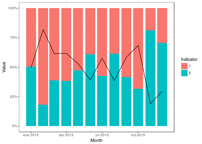
这给出了:

我只希望出现其中的一行,如果这样的东西在geom_line层中工作,我就可以做到:
geom_line(subset = .(Indicator == 1), aes(x = Month, y = `Relative Value`))
会话信息:
R版本3.2.1(2015-06-18)平台:x86_64-w64-mingw32/x64(64-bit)运行于:Windows Server 2012 x64(build 9200)
地区: 2LC_COLLATE=English_UnitedLC_CTYPE=English_United1252[3]LC_MONETARY=English_UnitedLC_NUMERIC=C[5]LC_TIME=English_United
附加的基础包:2个统计图形grDevices utils
数据集方法基础
其他附包: 2scales_0.3.0lubridate_1.3.3ggplot2_1.0.1lazyeval_0.1.10dplyr_0.4.3RSQLite_1.0.0
readr_0.2.2[8]RJDBC_0.2-5DBI_0.3.1rJava_0.9-7
通过命名空间加载(未附加):2Rcpp_0.12.2
knitr_1.11magrittr_1.5MASS_7.3-40munsell_0.4.2
lattice_0.20-31[7]colorspace_1.2-6R6_2.1.1stringr_1.0plyr_1.8.3tools_3.2.1parallel_3.2.1[13]grid_3.2.1
gtable_0.1.2htmltools_0.2.6yaml_2.1.13assertthat_0.1
digest_0.6.8[19]reshape2_1.4.1memoise_0.2.1
Rcpp_0.8.1knitr_1.3magrittr_1.0-1MASS_7.7-12
[25]munsell_0.3-10
tl; dr:将数据作为函数传递给该层,该函数根据您的标准对绘图的数据进行子集。
根据层上的ggplots留档,当将数据传递到新层时,您有3个选项:
前两个选项是最常见的,但是当数据已经通过pyps修改时,第三个选项非常适合我们的需求。
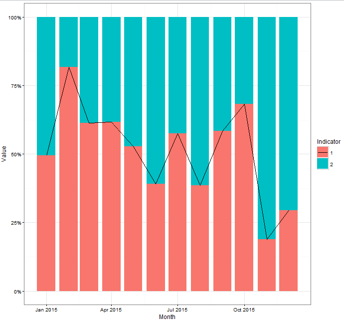
在您的示例中,将data=function(x)subset(x, Queator==1)添加到geom_line中可以做到这一点:
library(dplyr)
library(ggplot2)
library(scales)

set.seed(12345)
df_example = data_frame(Month = rep(seq.Date(as.Date("2015-01-01"),
                                             as.Date("2015-12-31"), by = "month"), 2),
                        Value = sample(seq.int(30, 150), size = 24, replace = TRUE),
                        Indicator = as.factor(rep(c(1, 2), each = 12)))

df_example %>%
  group_by(Month) %>%
  mutate(`Relative Value` = Value/sum(Value)) %>%
  ungroup() %>%
  ggplot(aes(x = Month, y = Value, fill = Indicator, group = Indicator)) +
  geom_bar(position = "fill", stat = "identity") +
  theme_bw()+
  scale_y_continuous(labels = percent_format()) +
  geom_line(data = function(x) subset(x,Indicator == 1), aes(x = Month, y = `Relative Value`))
这是由此产生的情节
library(dplyr)
library(ggplot2)
library(scales)

set.seed(12345)
df_example = data_frame(Month = rep(seq.Date(as.Date("2015-01-01"),
                                             as.Date("2015-12-31"), by = "month"), 2),
                        Value = sample(seq.int(30, 150), size = 24, replace = TRUE),
                        Indicator = as.factor(rep(c(1, 2), each = 12)))

df_example %>%
  group_by(Month) %>%
  mutate(`Relative Value` = Value/sum(Value)) %>%
  ungroup() %>%
  ggplot(aes(x = Month, y = Value, fill = Indicator, group = Indicator)) +
  geom_bar(position = "fill", stat = "identity") +
  theme_bw()+
  scale_y_continuous(labels = percent_format()) +
  geom_line(aes(x = Month, y = `Relative Value`,linetype=Indicator)) +
  scale_linetype_manual(values=c("1"="solid","2"="blank"))
产量:
您可能会从stat_subset()中受益,这是我为个人使用而制作的统计数据,可在metR中找到:https://eliocamp.github.io/metR/articles/Visualization-tools.html#stat_subset
它有一个称为subset的美学,它采用逻辑表达式并相应地对数据进行子集。
library(dplyr)
library(ggplot2)
library(scales)

set.seed(12345)
df_example = data_frame(Month = rep(seq.Date(as.Date("2015-01-01"),
                                             as.Date("2015-12-31"), by = "month"), 2),
                        Value = sample(seq.int(30, 150), size = 24, replace = TRUE),
                        Indicator = as.factor(rep(c(1, 2), each = 12)))

df_example %>%
   group_by(Month) %>%
   mutate(`Relative Value` = Value/sum(Value)) %>%
   ungroup() %>%
   ggplot(aes(x = Month, y = Value, fill = Indicator, group = Indicator)) +
   geom_bar(position = "fill", stat = "identity") +
   theme_bw()+
   scale_y_continuous(labels = percent_format()) +
   metR::stat_subset(aes(x = Month, y = `Relative Value`, subset = Indicator == 1),
               geom = "line")