
当我试图用ggplot2制作柱状图时,我在理解为什么日期、标签和中断的处理不像我在R中预期的那样有效时遇到了问题。
我正在寻找:
%Y-b格式我已经将我的数据上传到pastebin,以使其可复制。我已经创建了几个专栏,因为我不确定这样做的最佳方式:
> dates <- read.csv("http://pastebin.com/raw.php?i=sDzXKFxJ", sep=",", header=T)
> head(dates)
       YM       Date Year Month
1 2008-Apr 2008-04-01 2008     4
2 2009-Apr 2009-04-01 2009     4
3 2009-Apr 2009-04-01 2009     4
4 2009-Apr 2009-04-01 2009     4
5 2009-Apr 2009-04-01 2009     4
6 2009-Apr 2009-04-01 2009     4
以下是我尝试过的:
library(ggplot2)
library(scales)
dates$converted <- as.Date(dates$Date, format="%Y-%m-%d")
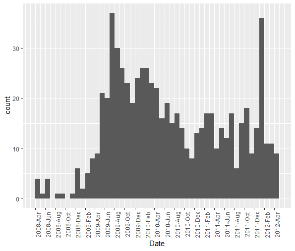
ggplot(dates, aes(x=converted)) + geom_histogram()
+ opts(axis.text.x = theme_text(angle=90))
这就产生了这个图表。不过,我想要%Y-%b格式,因此我四处寻找并尝试了以下方法,基于此,所以:
ggplot(dates, aes(x=converted)) + geom_histogram()
+    scale_x_date(labels=date_format("%Y-%b"),
+    breaks = "1 month")
+    opts(axis.text.x = theme_text(angle=90))

stat_bin: binwidth defaulted to range/30. Use 'binwidth = x' to adjust this.
这给了我这个图表
我在ggplot2文档的scale\u x\u date部分完成了该示例,当我使用相同的x轴数据时,geom\u line()显示为正确断开、标记和居中刻度。我不明白为什么柱状图不同。
我最初认为高登的回答帮助我解决了我的问题,但现在仔细观察后感到困惑。请注意代码后两个答案的结果图之间的差异。
假设两者都是:
library(ggplot2)
library(scales)
dates <- read.csv("http://pastebin.com/raw.php?i=sDzXKFxJ", sep=",", header=T)
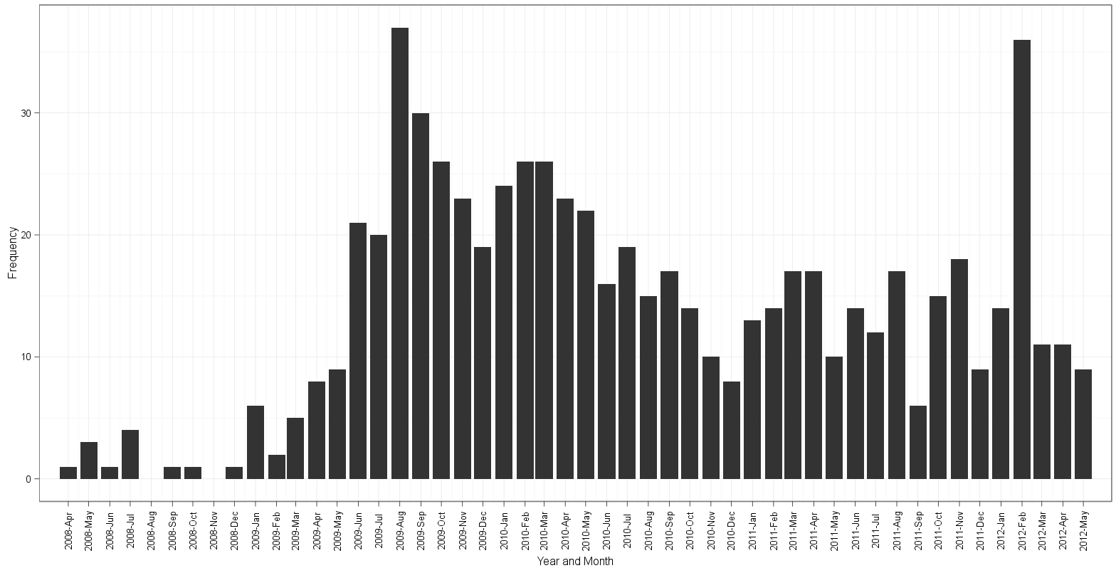
根据下面@edgester的回答,我能够做到以下几点:
freqs <- aggregate(dates$Date, by=list(dates$Date), FUN=length)
freqs$names <- as.Date(freqs$Group.1, format="%Y-%m-%d")

ggplot(freqs, aes(x=names, y=x)) + geom_bar(stat="identity") +
       scale_x_date(breaks="1 month", labels=date_format("%Y-%b"),
                    limits=c(as.Date("2008-04-30"),as.Date("2012-04-01"))) +
       ylab("Frequency") + xlab("Year and Month") +
       theme_bw() + opts(axis.text.x = theme_text(angle=90))
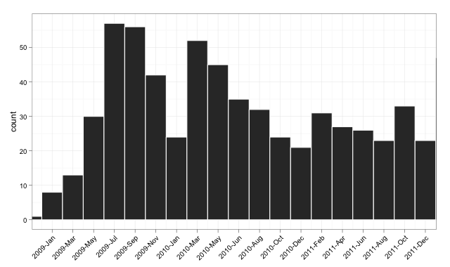
以下是我根据高登的回答所做的尝试:
dates$Date <- as.Date(dates$Date)
ggplot(dates, aes(x=Date)) + geom_histogram(binwidth=30, colour="white") +
       scale_x_date(labels = date_format("%Y-%b"),
                    breaks = seq(min(dates$Date)-5, max(dates$Date)+5, 30),
                    limits = c(as.Date("2008-05-01"), as.Date("2012-04-01"))) +
       ylab("Frequency") + xlab("Year and Month") +
       theme_bw() + opts(axis.text.x = theme_text(angle=90))
根据edgester的方法绘制:
根据gauden的方法绘制:

注意以下几点:
表(日期$Date)显示有19个实例2009-12-01和26个实例2010-03-01在数据对这里的差异有什么想法吗?edgester创建单独计数的方法
另一方面,这里还有其他一些位置,为寻求帮助的路人提供有关日期和ggplot2的信息:
format=选项对我不起作用 日期向量看作是连续的,但觉得效果不太好。它看起来像是一次又一次地覆盖着相同的标签文本,所以字母看起来有点奇怪。分布有点正确,但有奇数的中断。我基于公认答案的尝试是这样的(结果在这里)
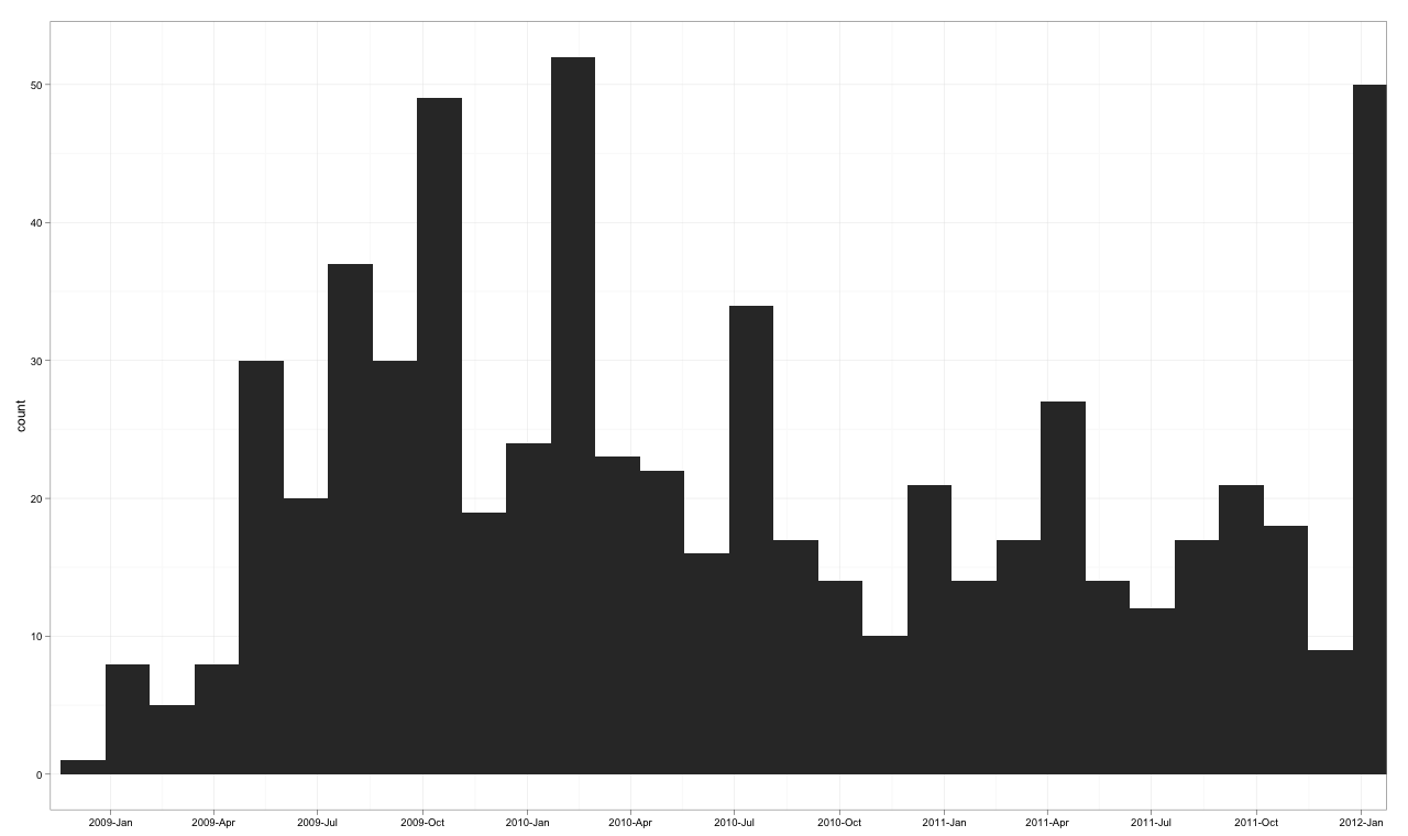
使现代化
我更新了这个例子来演示对齐标签和设置绘图的限制。我还演示了as。Date在一致使用时确实有效(实际上,它可能比我之前的例子更适合您的数据)。
下面是(有些过度)注释的代码:
library("ggplot2")
library("scales")

dates <- read.csv("http://pastebin.com/raw.php?i=sDzXKFxJ", sep=",", header=T)
dates$Date <- as.Date(dates$Date)

# convert the Date to its numeric equivalent
# Note that Dates are stored as number of days internally,
# hence it is easy to convert back and forth mentally
dates$num <- as.numeric(dates$Date)

bin <- 60 # used for aggregating the data and aligning the labels

p <- ggplot(dates, aes(num, ..count..))
p <- p + geom_histogram(binwidth = bin, colour="white")

# The numeric data is treated as a date,
# breaks are set to an interval equal to the binwidth,
# and a set of labels is generated and adjusted in order to align with bars
p <- p + scale_x_date(breaks = seq(min(dates$num)-20, # change -20 term to taste
                                   max(dates$num),
                                   bin),
                      labels = date_format("%Y-%b"),
                      limits = c(as.Date("2009-01-01"),
                                 as.Date("2011-12-01")))

# from here, format at ease
p <- p + theme_bw() + xlab(NULL) + opts(axis.text.x  = theme_text(angle=45,
                                                                  hjust = 1,
                                                                  vjust = 1))
p
我尝试了一个解决方案,它可以在ggplot2中完成所有事情,在没有聚合的情况下绘制,并在2009年初和2011年底之间设置x轴的限制。
library("ggplot2")
library("scales")

dates <- read.csv("http://pastebin.com/raw.php?i=sDzXKFxJ", sep=",", header=T)
dates$Date <- as.POSIXct(dates$Date)

p <- ggplot(dates, aes(Date, ..count..)) +
    geom_histogram() +
    theme_bw() + xlab(NULL) +
    scale_x_datetime(breaks = date_breaks("3 months"),
                     labels = date_format("%Y-%b"),
                     limits = c(as.POSIXct("2009-01-01"),
                                as.POSIXct("2011-12-01")) )

p
当然,它可以通过在轴上玩标签选项来完成,但这是在绘图包中使用一个干净的短例程来完成绘图。
我知道这是一个古老的问题,但是对于2021(或以后)的任何人来说,使用<代码> Stuts= < /Cord>参数> <代码> GEOMYSCORGROM()/代码>,并创建一个小的快捷功能来生成所需的序列,可以做得更容易。
dates <- read.csv("http://pastebin.com/raw.php?i=sDzXKFxJ", sep=",", header=T)

dates$Date <- lubridate::ymd(dates$Date)

by_month <- function(x,n=1){
  seq(min(x,na.rm=T),max(x,na.rm=T),by=paste0(n," months"))
}

ggplot(dates,aes(Date)) +
  geom_histogram(breaks = by_month(dates$Date)) +
  scale_x_date(labels = scales::date_format("%Y-%b"),
               breaks = by_month(dates$Date,2)) +
  theme(axis.text.x = element_text(angle=90))
我认为关键是你需要在ggplot之外进行频率计算。将aggregate()与geom_bar(stat=“identity”)一起使用,以获得没有重新排序因子的直方图。下面是一些示例代码:
require(ggplot2)

# scales goes with ggplot and adds the needed scale* functions
require(scales)

# need the month() function for the extra plot
require(lubridate)

# original data
#df<-read.csv("http://pastebin.com/download.php?i=sDzXKFxJ", header=TRUE)

# simulated data
years=sample(seq(2008,2012),681,replace=TRUE,prob=c(0.0176211453744493,0.302496328928047,0.323054331864905,0.237885462555066,0.118942731277533))
months=sample(seq(1,12),681,replace=TRUE)
my.dates=as.Date(paste(years,months,01,sep="-"))
df=data.frame(YM=strftime(my.dates, format="%Y-%b"),Date=my.dates,Year=years,Month=months)
# end simulated data creation

# sort the list just to make it pretty. It makes no difference in the final results
df=df[do.call(order, df[c("Date")]), ]

# add a dummy column for clarity in processing
df$Count=1

# compute the frequencies ourselves
freqs=aggregate(Count ~ Year + Month, data=df, FUN=length)

# rebuild the Date column so that ggplot works
freqs$Date=as.Date(paste(freqs$Year,freqs$Month,"01",sep="-"))

# I set the breaks for 2 months to reduce clutter
g<-ggplot(data=freqs,aes(x=Date,y=Count))+ geom_bar(stat="identity") + scale_x_date(labels=date_format("%Y-%b"),breaks="2 months") + theme_bw() + opts(axis.text.x = theme_text(angle=90))
print(g)

# don't overwrite the previous graph
dev.new()

# just for grins, here is a faceted view by year
# Add the Month.name factor to have things work. month() keeps the factor levels in order
freqs$Month.name=month(freqs$Date,label=TRUE, abbr=TRUE)
g2<-ggplot(data=freqs,aes(x=Month.name,y=Count))+ geom_bar(stat="identity") + facet_grid(Year~.) + theme_bw()
print(g2)