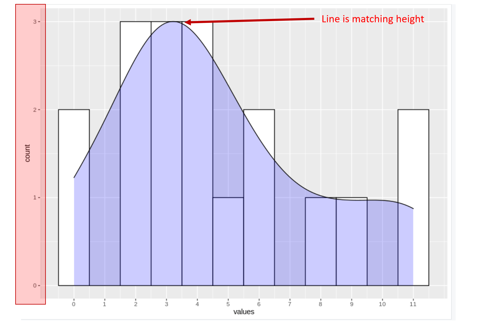
我需要将密度线与geom_直方图的高度对齐,并将计数值保留在y轴上,而不是密度上。
我有以下两个版本:
#  Creating dataframe
library(ggplot2)

values <- c(rep(0,2), rep(2,3), rep(3,3), rep(4,3), 5, rep(6,2), 8, 9, rep(11,2))
data_to_plot <- as.data.frame(values)
# Option 1 ( y scale shows frequency, but geom_density line and geom_histogram are not matching )
ggplot(data_to_plot, aes(x = values)) +
  geom_histogram(aes(y = ..count..), binwidth = 1, colour= "black", fill = "white") +
  geom_density(aes(y=..count..), fill="blue", alpha = .2)+
  scale_x_continuous(breaks = seq(0, max(data_to_plot$values), 1))
# Option 2 (geom_density line and geom_histogram are matching, but y scale density = 1)

ggplot(data_to_plot, aes(x = values)) +
  geom_histogram(aes(y = after_stat(ndensity)), binwidth = 1, colour= "black", fill = "white") +
  geom_density(aes(y = after_stat(ndensity)), fill="blue", alpha = .2)+
  scale_x_continuous(breaks = seq(0, max(data_to_plot$values), 1))
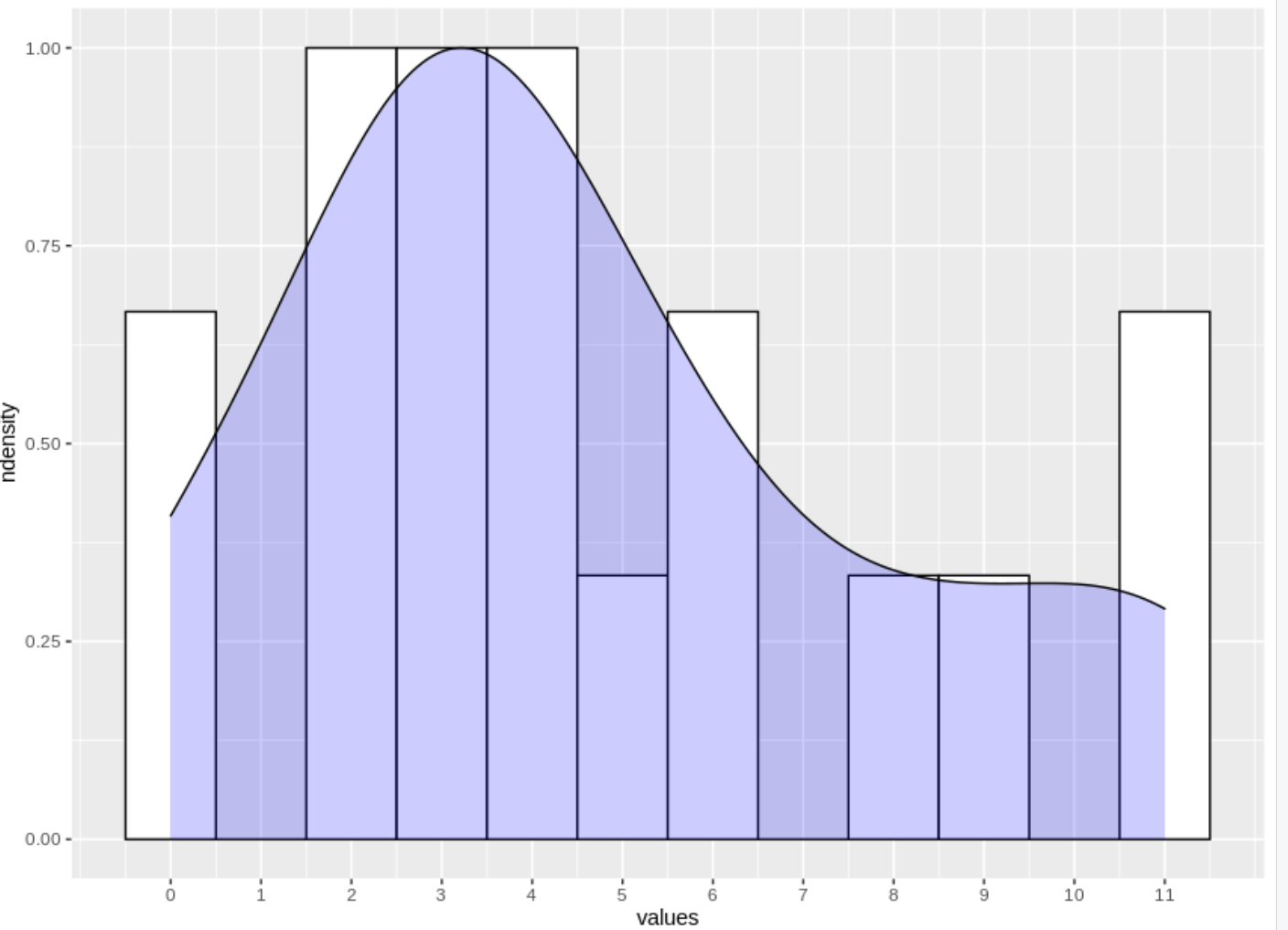
我需要的是选项2中的绘图,但选项1中的Y比例。我可以通过为这个特定的数据添加(aes(y=1.25*... count...)来获得它,但是我的数据不是静态的,这对另一个数据集不起作用(只需修改值来测试):
# Option 3 (with coefficient in aes())
ggplot(data_to_plot, aes(x = values)) +
  geom_histogram(aes(y = ..count..), binwidth = 1, colour= "black", fill = "white") +
  geom_density(aes(y=1.25*..count..), fill="blue", alpha = .2)+
  scale_x_continuous(breaks = seq(0, max(data_to_plot$values), 1))
我不能硬编码系数或箱子。这个问题与这里讨论的问题很接近,但对我的案例不起作用:
通过编程将geom_密度绘制的密度曲线缩放到与geom_直方图相似的高度?
如何将geom_density和geom_histogram放在相同的规模
密度曲线始终表示0到1之间的数据,而计数数据是1的倍数。因此,将这些数据绘制到同一y轴上几乎没有意义。
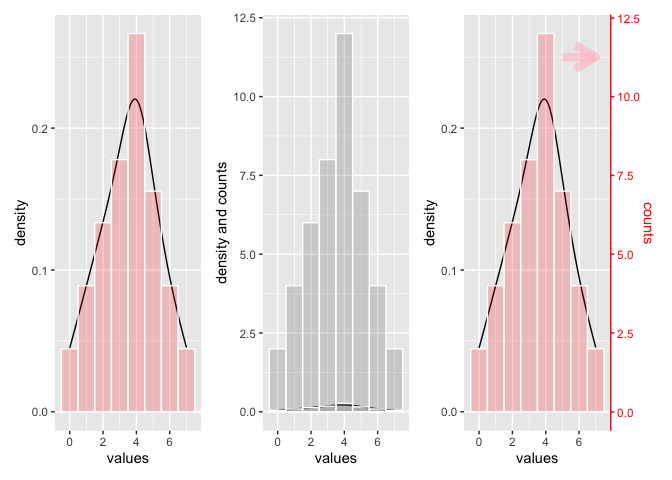
左图显示了密度线和直方图,数据与您提供的数据相似-我刚刚添加了一些。条形图的高度显示对应x值的计数百分比。y刻度小于1。
右图与左图相同,但添加了另一个直方图来显示计数。y尺度上升,2个密度图缩小。
如果您想将两者缩放到相同的比例,您可以通过计算缩放因子来实现这一点。我使用这个缩放因子向第三个图添加了一个次要的y轴,并相应地出售了sec y轴。
为了弄清楚什么属于什么比例,我把第二个y轴和属于它的数据涂成红色。
library(ggplot2)
library(patchwork)
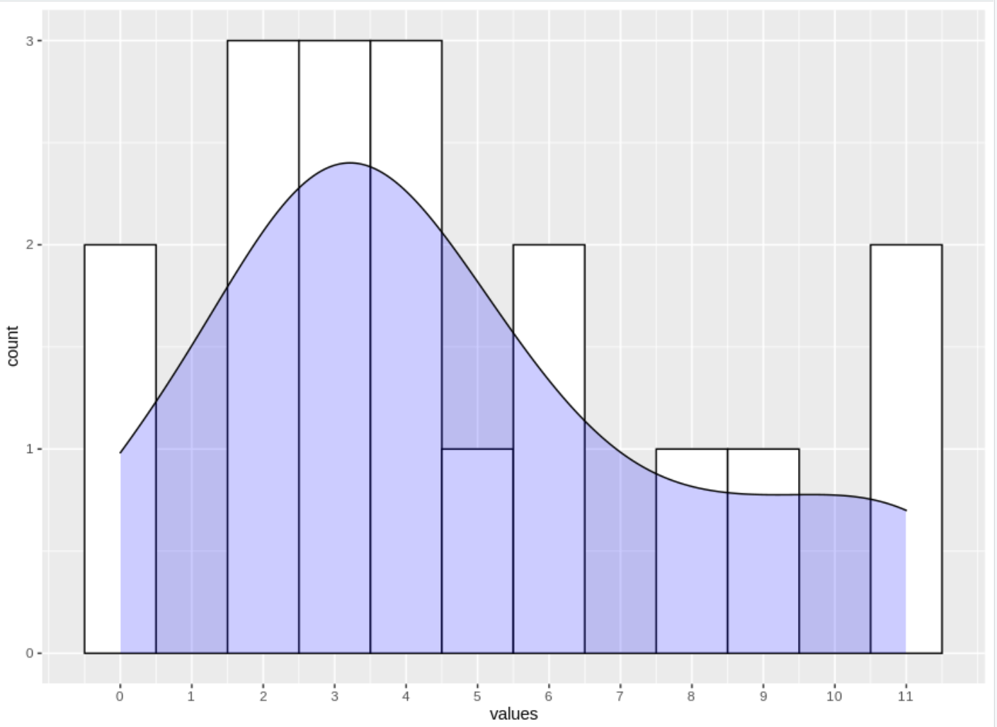
values <- c(rep(0,2),rep(1,4), rep(2,6), rep(3,8), rep(4,12), rep(5,7), rep(6,4),rep(7,2))
df <- as.data.frame(values)
p1 <- ggplot(df, aes(x = values)) +
stat_density(geom = 'line') +
geom_histogram(aes(y = ..density..), binwidth = 1,color = 'white', fill = 'red', alpha = 0.2)
p2 <- ggplot(df, aes(x = values)) +
stat_density(geom = 'line') +
geom_histogram(aes(y = ..count..), binwidth = 1, color = 'white', alpha = 0.2) +
geom_histogram(aes(y = ..density..), binwidth = 1, color = 'white', alpha = 0.2) +
ylab('density and counts')
# Find maximum of ..density..
m <- max(table(df$values)/sum(table(df$values)))
# Find maxium of df$values
mm <- max(table(df$values))
# Create Scaling factor for secondary axis
scaleF <- m/mm
p3 <- p1 + scale_y_continuous(
limits = c(0, m),
# Features of the first axis
name = "density",
# Add a second axis and specify its features
sec.axis = sec_axis( trans=~(./scaleF), name = 'counts')
) +
theme(axis.ticks.y.right = element_line(color = "red"),
axis.line.y.right = element_line(color = 'red'),
axis.text.y.right = element_text(color = 'red'),
axis.title.y.right = element_text(color = 'red')) +
annotate("segment", x = 5, xend = 7,
y = 0.25, yend = .25, colour = "pink", size=3, alpha=0.6, arrow=arrow())
p1 | p2 | p3