
我很难在R中创建绘图。如果我有如下数据
我想创建:
X轴是Sepal.length,Sepal。宽度,花瓣。宽度,花瓣。长度,y轴是不同种类,高度是值。并根据y轴用不同的颜色填充每个条形图。
谢谢你!
到目前为止,我已经尝试过:
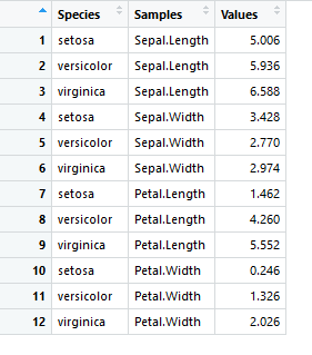
iris_mean <- aggregate(iris[,1:4], by=list(Species=iris$Species), FUN=mean)
library(reshape2)
df_mean <- melt(iris_mean, id.vars=c("Species"), variable.name = "Samples",
  value.name="Values")

ggplot(df_mean,aes(Samples,Values))+
geom_bar(aes(fill=Species),stat="identity")+
  facet_grid(Species~.,scale='free',space='free')+theme(panel.margin = unit(0.1, "lines"))


ggplot(df_mean,aes(x=Samples,y=Species,height =Values))+
  geom_density_ridges2(aes(fill=Species),stat='identity',
                       scale=1.5,
                       alpha=0.1,
                       lty = 1.1)
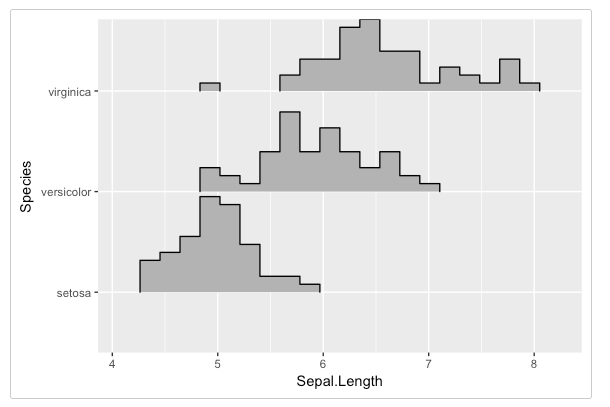
你的刻面情节在正确的轨道上。就像我在评论中说的,你试图展示价值的分布,而不是价值的手段。您可以手动设置分隔符并计算在geom_bar中显示的计数,但这很容易变得非常复杂,特别是因为不同类型的度量值处于不同的尺度上。我建议坚持使用简单的直方图。我使用聚集而不是熔体来生成长数据-这只是偏好。
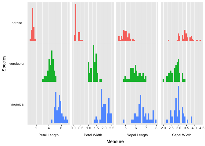
除了你所拥有的,这只是一个问题。使用发行版,以及2。巧妙地运用主题。如果移动镶嵌面标签、旋转左侧条带、取出条带背景并删除面板之间的垂直间距,则基本上得到了脊线图。我不太熟悉ggridges,但我猜它也有类似的功能。从这里,您可以调整您认为合适的方式。
library(tidyverse)

iris_long <- as_tibble(iris) %>%
  gather(key = measure, value = value, -Species)

ggplot(iris_long, aes(x = value, fill = Species)) +
  # geom_density_ridges() +
  geom_histogram(show.legend = F) +
  scale_y_continuous(breaks = NULL) +
  labs(x = "Measure", y = "Species") +
  facet_grid(Species ~ measure, scales = "free", switch = "both") +
  theme(strip.background = element_blank(), strip.text.y = element_text(angle = 180),
        strip.placement = "outside", panel.spacing.y = unit(0, "cm"))
#> `stat_bin()` using `bins = 30`. Pick better value with `binwidth`.
由reprex软件包(v0.2.0)于2018年7月19日创建。
仅供参考,最好发布你的数据,而不是放在屏幕截图中,你也应该发布你到目前为止尝试过的代码。
您要查找的是facet\u grid:
library(tidyverse)

iris_summarized <- iris %>%
 group_by(Species, Sepal.Length) %>%
 summarize(total = n())

ggplot(iris_summarized, aes(x = Sepal.Length, y = total, fill = Species)) + # the fill argument sets the color for the bars
 geom_col() + # use geom_col instead of geom_bar if you are explicitly referencing counts in your data set
 facet_grid(Species ~ ., switch = "y") + # the switch = "y" argument moves the species name to the left side of the graph
 theme(strip.placement = "outside", # this moves the title of each facet to the left of the axis
       strip.background = element_blank()) # this makes the title of each facet not have a background