
我有两个不同梯度背景的div,我需要在它们之间创建一个S形曲线。
下面是渐变div的示例fiddle:https://jsfiddle.net/jerrygoyal/rjyfc46c/2/
<div id="section1">

</div>
<div id="section2">

</div>
#section1{
  height:200px;
  background: linear-gradient(to bottom right, #ad3, #add);
}
#section2{
  height:200px;
  background: linear-gradient(to bottom right, #de350b, #0065ff);
}
有几件事在我脑海中闪过,但是:
-SVG:不知道如何处理其他渐变div.
-border-radius:无法获得真正的S样曲线,而且当我调整屏幕大小时它变得很难看。
-clip-path:某些浏览器不支持https://caniuse.com/css-clip-path
-png image:nope! 需要动态的内容。
如有任何帮助,我们将不胜感激!
P.S:未来读者的必读:https://cs-tricks.com/creating-non-矩形-headers/
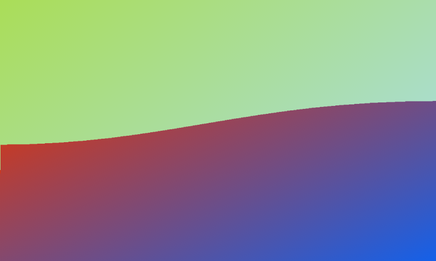
下面是一个使用线性梯度和SVG的解决方案。
null
.container {
  width: 500px;
  height: 200px;
  background:linear-gradient(to bottom right, #de350b, #0065ff);
}
svg {
  width:100%;
}
<div class="container">
<svg mlns='http://www.w3.org/2000/svg' viewBox="0 0 64 64">
<defs>
<linearGradient id="grad" x1="0%" y1="0%" x2="100%" y2="100%">
<stop offset="0%" stop-color="#ad3" />
<stop offset="100%" stop-color="#add" />
</linearGradient>
</defs>
<path d='M0 10 C30 28 38 0 64 10 L64 0 L0 0 Z' fill="url(#grad)"/>
</svg>
</div>