
我有以下要求:
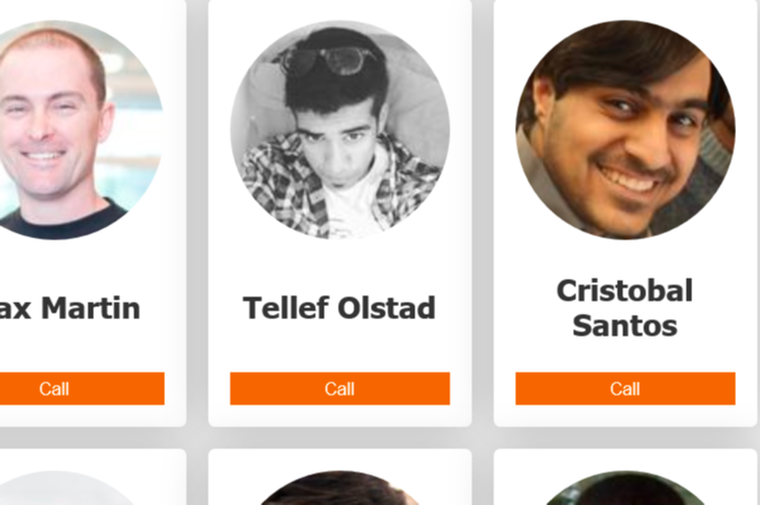
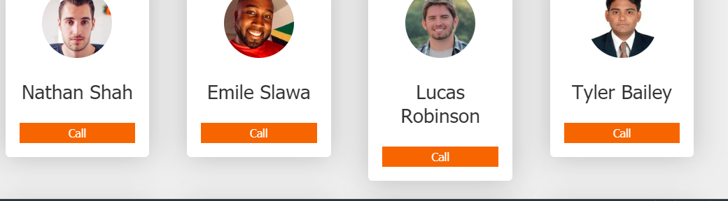
其中图像,名称和按钮是规则大小,但我的看起来很奇怪,不规则。 请查看以下内容:
Codepen链接为:https://Codepen.io/anisharya16/pen/vylznmj
如何修复这是响应和常规卡大小,应该有没有更改HTML? 需要帮助。
我使用的是HTML,SCSS,Vanilla JavaScript
应用css下面的卡片标题最小-高度:60px;
.cards-item__card--title {
font-size: 28px;
min-height: 60px;}
一些解决方案:
可以使用max-height定义最大高度
您可以将段落设置为不使用空格中断行:nowrap;
对于非常大的名称,可以定义一个“。。。” 以便名称不会超出卡的div,使用overflow:hidden; 和文本溢出:省略号;
应用以下规则:
.cards-item__card--title {
  display: flex;
  min-height: 60px;
  align-items: center;
  justify-content: center;
  font-size: 1.667em;
  text-overflow: ellipsis;
}
您可以使用模板文字来简单地呈现。
null
const config = {
  url: 'https://api.randomuser.me',
  numberCards: 12,
  genderMale: 'male'
}

render(config)

function render(config) {
  const url = `${config.url}?results=${config.numberCards}&gender=${config.genderMale}`

  fetch(url)
    .then(response => response.json())
    .then(apiResponse => {
      // Output API response to console to view.
      //console.log(apiResponse.results);

      // Card Implementation
      var myapp = document.querySelector('.card__wrapper');
      myapp.innerHTML = renderCards(apiResponse.results);
    })
}

function renderCards(users) {
  return `
    <ul class="card__wrapper__maincontent">
      ${users.map(renderCard).join('')}
    </ul>
  `
}

function renderCard(user) {
  return `
    <li class="card__wrapper__maincontent__cards-item">
      <div class="cards-item__card">
        <img class="cards-item__card--image"
          src="${user.picture.large}" alt="lorem ipsum"
          style="width:100px;height:100px">
        <p class="cards-item__card--title">
          ${user.name.first} ${user.name.last}
        </p>
     <a class="cards-item__card--cta">Call</a></div></li>
  `
}
:root {
--background-color: #eee;
--text-color: #333;
--card-background: #fff;
--card-cta-background: #e26d00;
--card-cta-color: #fff;
--default-spacing: 20px;
}
// default styling
*,
*:after,
*:before {
box-sizing: border-box;
}
ul {
list-style-type: none;
}
ul li {
display: inline-block;
}
body {
background-color: var(--background-color);
color: var(--text-color);
font-family: Tahoma, sans-serif;
margin: 0;
padding: 0;
}
a {
text-decoration: none;
display: block;
}
a:hover {
text-decoration: underline;
}
// Card
.card__wrapper {
display: flex;
justify-content: space-between;
margin: 0 auto;
max-width: 1024px;
}
.cards-item__card {
background-color: var(--card-background);
border-radius: 6px;
filter: drop-shadow(0 0 20px rgba(0, 0, 0, 0.2));
padding: var(--default-spacing);
margin: var(--default-spacing);
text-align: center;
}
.cards-item__card--image {
border-radius: 50%;
}
.cards-item__card--title {
display: flex;
min-height: 60px;
align-items: center;
justify-content: center;
font-size: 1.667em;
text-overflow: ellipsis;
}
.cards-item__card--cta {
background-color: var(--card-cta-background);
color: var(--card-cta-color);
border: none;
width: 100%;
padding: 5px;
bottom: 0px;
}
// New Class
.card__wrapper__maincontent {
display: flex;
flex-wrap: wrap;
justify-content: space-between;
list-style: none;
margin: 0;
padding: 0;
}
@media (max-width: 450px) {
.card__wrapper__maincontent__cards-item {
width: 100%;
}
}
@media (min-width: 450px) {
.card__wrapper__maincontent__cards-item {
width: 50%;
}
}
@media (min-width: 700px) {
.card__wrapper__maincontent__cards-item {
width: 33.3333%;
}
}
@media (min-width: 1024px) {
.card__wrapper__maincontent__cards-item {
width: 24%;
}
}<section>
<main class="card__wrapper"></main>
</section>