
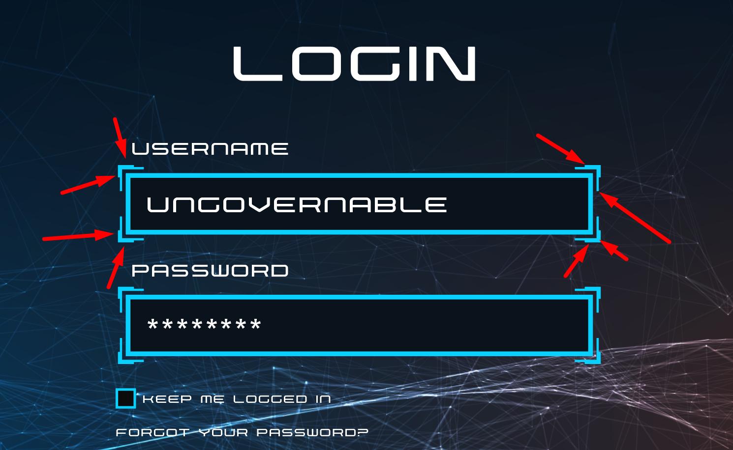
我用CSS设计输入。 我很努力地尝试,但我不能得到照片上的样子。 我怎样才能使输入边与css如图所示?
我的代码:
null
body{
 background:black;
}

.form-control{
    background: #0A131B;
    border: 2px solid #08D1FF;
    outline: none;
    color: white;
    padding: 5px 7px;
    font-size: 16px;
    font-family: nebularegular, sans-serif;
}

.form-group label{
    color: white;
    font-size: 13px;
    display: block;
    margin-left: 5px;
    margin-bottom: 5px;
}
<div class="form-group">
<label>Email address</label>
<input type="text" class="form-control">
</div>null
多个背景可以做到这一点。 我将考虑一个额外的容器,以避免有一个非常大的背景定义,但它可以做到没有额外的容器:
null
body {
  background: black;
}
.input {
  display:inline-block;
  border: 1px solid transparent; /*the space for the gradient */
  background:
      linear-gradient(#08D1FF,#08D1FF) top left,
      linear-gradient(#08D1FF,#08D1FF) top left,
      linear-gradient(#08D1FF,#08D1FF) bottom left,
      linear-gradient(#08D1FF,#08D1FF) bottom left,
      linear-gradient(#08D1FF,#08D1FF) bottom right,
      linear-gradient(#08D1FF,#08D1FF) bottom right,
      linear-gradient(#08D1FF,#08D1FF) top right,
      linear-gradient(#08D1FF,#08D1FF) top right;
  background-size:1px 8px,8px 1px; /* 1px = the border width (thickness) | 8px = length*/
  background-origin:border-box;
  background-repeat:no-repeat;
}
.form-control {
  border: 4px solid transparent; /* the space for the gradient + the gap between the box-shadow */
  background: inherit; /* we inherit the same thing */
  background-size:2px 15px,15px 2px;  /* 2px = thickness | 15px = length*/
  box-shadow:0 0 0 2px #08D1FF inset; /* the inner border created with shadow */

  outline: none;
  color: white;
  padding: 5px 7px;
  font-size: 36px;
  font-family: nebularegular, sans-serif;
}

.form-group label {
  color: white;
  font-size: 13px;
  display: block;
  margin-left: 5px;
  margin-bottom: 5px;
}
<div class="form-group">
<label>Email address</label>
<div class="input">
<input type="text" class="form-control">
</div>
</div>
所以,在回顾了你的工作之后,我想出了一个解决方案。
我认为问题是您没有一个容器包装器来处理您的登录。
body {
background: black;
}
.container{
border: 2px solid #08D1FF;
padding: 5px 1px;
font-size: 1rem; // 1 rem = 16px
}
form-control{
 background: #0A131B;
 border: 2px solid #08D1FF;
 outline: none;
 color: white;
 padding: 5px 7px;
 font-size: 16px;
 font-family: nebularegular, sans-serif;
}
.form-group lable{
color: white;
font-size: 13px;
display: block;
margin: 0 0 5px 5px;
}
你可以试试这个。 我知道你得稍微玩玩容器边框才能得到想要的效果。 希望这能为你指明正确的方向。
