我想在左边设置一个行类别标签位置。默认情况下,海运设置在图形的右侧。
这篇文章讨论了一种可能的方法,但我不能让它在我的代码中工作。Python seaborn FaceGrid:是否可以将行类别标签位置设置为左侧
下面是示例数据和FaceGrid以及热图绘图代码
import pandas as pd
import numpy as np
import itertools
import seaborn as sns
from matplotlib.colors import ListedColormap

print("seaborn version {}".format(sns.__version__))
# R expand.grid() function in Python
# https://stackoverflow.com/a/12131385/1135316
def expandgrid(*itrs):
   product = list(itertools.product(*itrs))
   return {'Var{}'.format(i+1):[x[i] for x in product] for i in range(len(itrs))}

methods=['method 1', 'method 2', 'method 3', 'method 4']
labels = ['label1','label2']
times = range(0,100,10)
data = pd.DataFrame(expandgrid(methods,labels, times, times))
data.columns = ['method','labels','dtsi','rtsi']
#data['nw_score'] = np.random.sample(data.shape[0])
data['nw_score'] = np.random.choice([0,1],data.shape[0])

labels_fill = {0:'red',1:'blue'}

def facet(data,color): #defining facet plot
    data = data.pivot(index="dtsi", columns='rtsi', values='nw_score')
    g = sns.heatmap(data, cmap=ListedColormap(['red', 'blue']), cbar=False,annot=True)

with sns.plotting_context(font_scale=5.5):
    g = sns.FacetGrid(data,row="labels", col="method", size=2, aspect=1, margin_titles=True)
    g = g.map_dataframe(facet)
    g.add_legend()
   # g.set(xlabel='common xlabel', ylabel='common ylabel')
    g.set_titles(col_template="{col_name}", fontweight='bold', fontsize=18)
哪个输出这个图

因此,我在代码中添加了@John Karasinski的解决方案,但仍然没有生成我希望在文章末尾看到的情节!
with sns.plotting_context(font_scale=5.5):
    g = sns.FacetGrid(data,row="labels", col="method", size=2, aspect=1,margin_titles=True)
    g = g.map_dataframe(facet)
    g.add_legend()
   # g.set(xlabel='common xlabel', ylabel='common ylabel')
    g.set_titles(col_template="{col_name}", fontweight='bold', fontsize=18)
    for i, axes_row in enumerate(g.axes):
        for j, axes_col in enumerate(axes_row):
            row, col = axes_col.get_title().split('|')

        if i == 0:
            axes_col.set_title(col.strip())
        else:
            axes_col.set_title('')

        if j == 0:
            ylabel = axes_col.get_ylabel()
            axes_col.set_ylabel(row.strip() + ' | ' + ylabel)
plt.show()
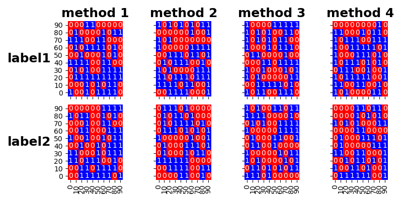
我想要的图表是;

谢谢!
with sns.plotting_context(font_scale=5.5):
    g = sns.FacetGrid(data,row="labels", col="method", size=2, aspect=1, margin_titles=False)
    g = g.map_dataframe(facet)
    g.add_legend()
    g.set_titles(template='')

    for ax,m in zip(g.axes[0,:],methods):
        ax.set_title(m, fontweight='bold', fontsize=18)
    for ax,l in zip(g.axes[:,0],labels):
        ax.set_ylabel(l, fontweight='bold', fontsize=18, rotation=0, ha='right', va='center')

    plt.tight_layout() # automatically adjust spacing of axes