正态/高斯分布公式:
f(x)=1/[σ*√(2*π)]e^[-(x-μ)^2/(2*σ^2)],
其中e=欧拉数,π=π,sigma (σ) = 均方差,μ (μ) = 均值。
这是我的代码:
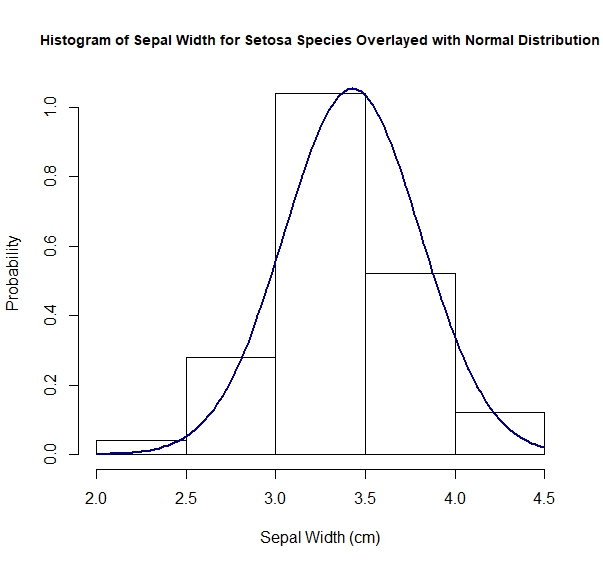
> hist(iris$Sepal.Width[iris$Species == "setosa"], probability = TRUE,
   main = "Histogram of Sepal Width for Setosa Species Overlayed with Normal Distribution",
   xlab = "Sepal Width (cm)", ylab = "Probability", cex.main = 0.9)

> sepal_width_setosa <- iris$Sepal.Width[iris$Species == "setosa"]

> sepal_width_setosa_mean <- mean(sepal_width_setosa)

> sepal_width_setosa_mean
[1] 3.428

> sepal_width_setosa_sd <- sd(sepal_width_setosa)

> sepal_width_setosa_sd
[1] 0.3790644

> sepal_width_setosa_variance = var(sepal_width_setosa)

> range(sepal_width_setosa)
[1] 2.3 4.4

> sepal_width_setosa_gaussian_distribution <- function(x){
  1 / (sepal_width_setosa_sd*sqrt(2*pi))*exp(-(x - sepal_width_setosa_mean)^2 / (2 * sepal_width_setosa_variance))
}


> curve(sepal_width_setosa_gaussian_distribution, from = 2.0, to = 4.5,
   col = "darkblue", lwd = 2, add = TRUE)
我会做另一个正常的视觉测试:
> qqnorm(sepal_width_setosa, main = "Normal Q-Q Plot of Sepal Width for species setosa")
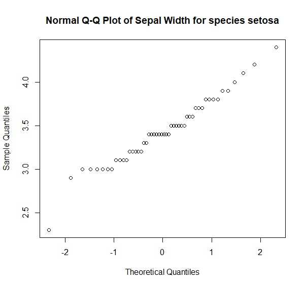
和正态性的统计检验
> library(nortest)
> ad.test(sepal_width_setosa)
安德森-达林正态性检验
数据:sepal_width_setosa
A=0.49096,p-值=0.2102
哇!p值大于0.05,所以我猜变量不是正态分布的。
问题:有没有一种方法可以把它放在一个循环中,得到所有鸢尾属物种的萼片宽度的直方图及其叠加的相关正态分布,然后并排显示图?如何将标准偏差标记1添加到3?
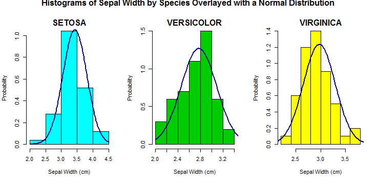
为了回答您关于循环和直方图的问题,我写了一些我通常会做什么的示例代码。
species_list <- split(iris, iris$Species) # split data.frame into lists by Species

par(mfrow = c(1,length(species_list))) # set the grid of the plot to be 1 row, 3 columns
for(i in 1:length(species_list)){ # using length(species_list) for the # of species
  # subsetting lists with double brackets `[[`
  hist(species_list[[i]]$Sepal.Width, probability = T,
       main = "", xlab = "Sepal Width (cm)", ylab = "Probability", # `main` is empty
       col = c("cyan","green3","yellow")[i]) # picks a new color each time (here out of 3)
  # my favorite function for plot titles
  mtext(toupper(names(species_list)[i]), # upper case species name for title
        side = 3, # 1 is bottom, 2 is left, 3 is top, 4 is right
        line = 0, # do not shift up or down
        font = 2) # 2 is bold
  # Simpler than building from scratch use the built in function:
  curve(dnorm(x, mean = mean(species_list[[i]]$Sepal.Width),
                 sd = sd(species_list[[i]]$Sepal.Width)),
                 yaxt = "n", add = TRUE, col = "darkblue", lwd = 2)
}
# At the end post a new title
mtext("Histograms of Sepal Width by Species Overlayed with a Normal Distribution",
      outer = TRUE, # this puts it outside of the 3 plots
      side = 3, line = -1, # shift it down so we can see it
      font = 2)
par(mfrow = c(1,1)) # set the plot parameters back to a single plot when finished